
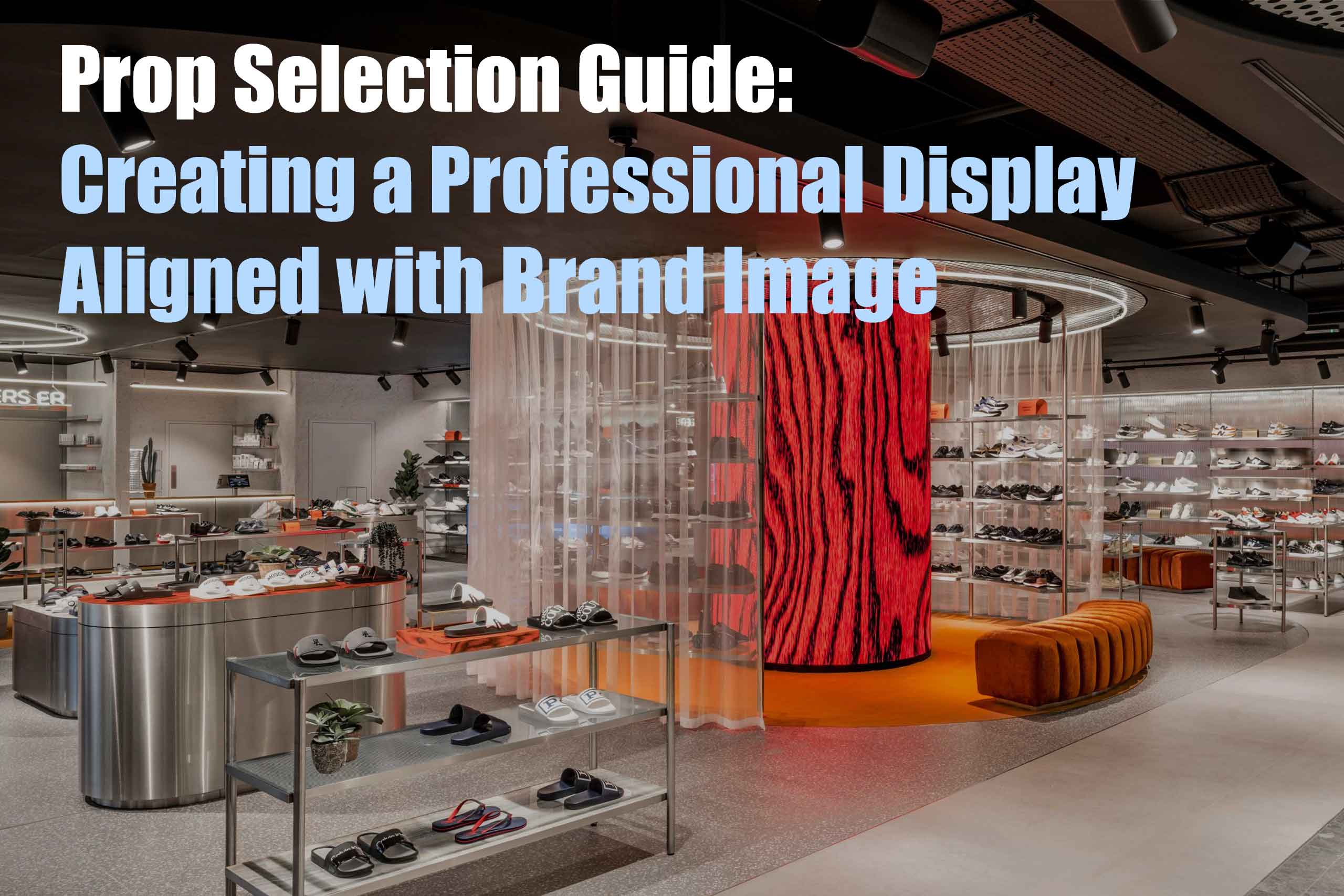
In the retail industry, display props are essential visual marketing tools that attract customer attention and communicate brand image and values. Carefully selecting display props can help you effectively showcase and emphasize your brand image, thus attracting your target audience.
This blog post will explore how to choose display props (retail display racks) by considering aspects such as materials, colors, design, brand values, and target audience alignment. It will provide corresponding case studies and relevant information to help you understand how to enhance your brand's professional image.
We will address the following questions:
※ How to Enhance Brand Image
※ Providing real-life examples from materials, colors, design, brand values, and more to help you better understand the importance of brand image in visual marketing.
※ Offering relevant information websites from various perspectives to help you quickly obtain the necessary resources.
With over 15 years of experience in the retail display props industry in China, we have insider knowledge to provide practical purchasing advice for design companies and retail store buyers.
So, let's get started.
(Note: There are many different names used to describe display shelves. These include Display Shelf, Display Rack, Display Fixture, Display Stand, POS Display, POP Display, and Point Of Purchase. However, for consistency, we will refer to Display Rack as the naming convention for
Table of Contents:
1. Researching and understanding the target audience in visual marketing.
3. Selecting materials in visual marketing that align with the brand image.
4. The power of color in visual marketing.
5.The practicality and functionality of showcasing props in visual marketing.
6. The quality and durability of showcasing props in visual marketing.
7. The importance of brand logos and symbols in professional displays.
1. Researching and understanding the target audience in visual marketing.
Researching and understanding the target audience: Before selecting showcasing props, it is crucial to deeply understand the target audience. Understanding their preferences, values, and lifestyles will help you choose showcasing props that resonate with them. For example, if your brand targets the younger generation as a fashion brand, you can choose trendy, modern, and innovative showcasing props to capture their attention.
Reference literature:
Pew Research Center (www.pewresearch.org)
Nielsen (www.nielsen.com)
Statista (www.statista.com)

2. The design of showcasing props should align with the brand positioning and target audience.
If your brand focuses on simplicity and modernity, you can choose sleek and streamlined showcasing props, avoiding overly complex designs. On the other hand, if your brand is luxurious and high-end, you can opt for showcasing props that feature exquisite materials, intricate details, and unique shapes to display your products. The design of showcasing props should pique customers' interest through their appearance and structure, reflecting the brand's story and personality.

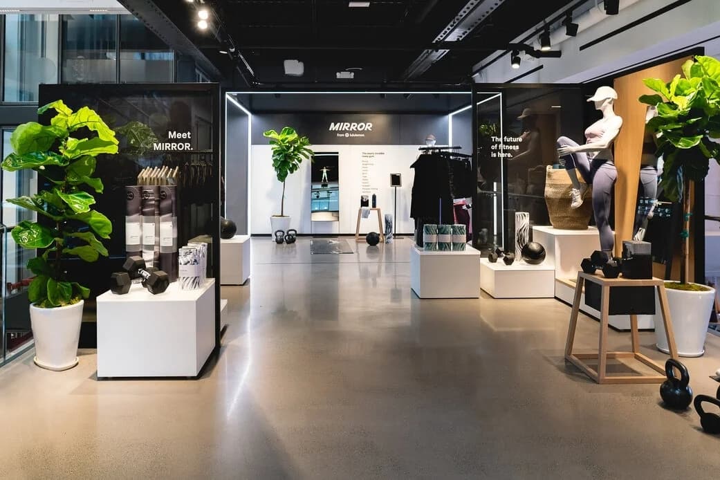
Photo: lululemon
Reference Case:Lululemon
Case Link:
Official Website: https://shop.lululemon.com/
Reference Case: https://retail-insider.com/retail-insider/2021/10/lululemon-officially-launches-interactive-home-gym-mirror-in-canada-including-in-store-spaces/
Lululemon is a fashionable athletic brand with a focus on fitness and yoga, dedicated to providing high-quality, stylish, and functional sportswear to its target audience. They skillfully use display props in their store designs to align with their brand positioning and target audience.
Lululemon's store designs convey the brand's positioning of health, vitality, and fashion through their display props. They utilize modern and trendy elements such as metal racks, transparent materials, and bright lighting to create a contemporary and vibrant shopping environment.
Functional Display Props:
Considering the brand's positioning and the needs of their target audience, Lululemon incorporates functional display props in their store design. They use movable sports equipment racks, multi-tiered clothing displays, and adjustable shoe shelves to showcase a variety of products in different types and sizes, providing convenient try-on and trial experiences.
Displaying the Brand Story:
To cater to the preferences and desires of their target audience, Lululemon employs personalized display props in their stores. They may use custom wooden display racks, soft fabric decorations, or artworks to add unique textures and visual appeal. These personalized display props create a distinctive atmosphere that aligns with the brand positioning and target audience.
Through these case studies, Lululemon demonstrates how to design display props that match the brand's positioning and target audience. They use modern and stylish display props that reflect the brand's positioning, provide functional display solutions, showcase the brand story and values, and utilize personalized elements to create a unique ambiance.
Literature References:
Behance :www.behance.net
Dribbble :www.dribbble.com
Retail Design Blog :www.retaildesignblog.net
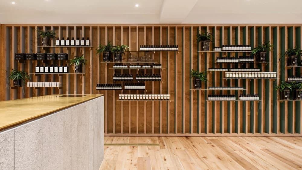
3. Choosing Materials Consistent with Brand Image
Choosing materials for display props that align with your brand image and reflect your brand's characteristics is essential. For example, if your brand emphasizes environmental sustainability, you can opt for display props made from renewable materials such as bamboo, cardboard, or recycled plastic. This not only aligns with your brand's values but also communicates your commitment to sustainability to customers.
Reference Case:
Case Study Links:
Official Website of Aesop: https://www.aesop.com/
Case Study 1: Aesop To Open 1st Mall-Based Store In Canada
Link: https://retail-insider.com/retail-insider/2018/09/aesop-to-open-1st-mall-based-store-in-canada/
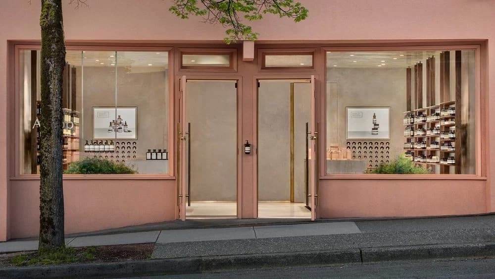
AESOP KITSILANO (VANCOUVER) LOCATION. PHOTO: AESOP WEBSITE
Aesop is a luxury skincare brand from Australia known for its use of natural ingredients and minimalist packaging. They place great emphasis on selecting materials that align with their brand image in their store designs to showcase their commitment to sustainability and high-quality values.
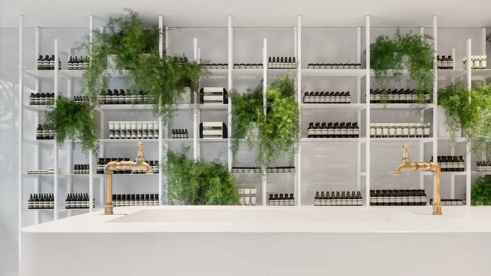
AESOP KITSILANO (VANCOUVER) LOCATION. PHOTO: AESOP WEBSITE
Aesop's store designs frequently incorporate natural materials such as wood, stone, and natural fibers. These materials are in line with the brand's focus on natural ingredients and sustainable development. For example, they use wooden display shelves, stone countertops, and decorative items made from natural fibers to create a simple yet comfortable ambiance.
Selection of Sustainable Materials:
Aesop is dedicated to sustainable development, and therefore, they choose to use sustainable materials in their store designs. For instance, they utilize certified sustainable wood or recycled materials to create furniture and decor. This material selection reflects the brand's commitment to environmental conservation and shared values of sustainable consumption with customers.
AESOP KITSILANO (VANCOUVER) LOCATION. PHOTO: AESOP WEBSITE
Through these case studies, Aesop demonstrates how the selection of materials consistent with the brand image creates a visual marketing effect in their stores. They effectively utilize natural materials, sustainable materials, and successfully convey the brand's values and sense of quality, establishing a strong connection with their target audience.
Literature References:
Material ConneXion (www.materialconnexion.com)
Sustainable Brands (www.sustainablebrands.com)
GreenBiz (www.greenbiz.com)
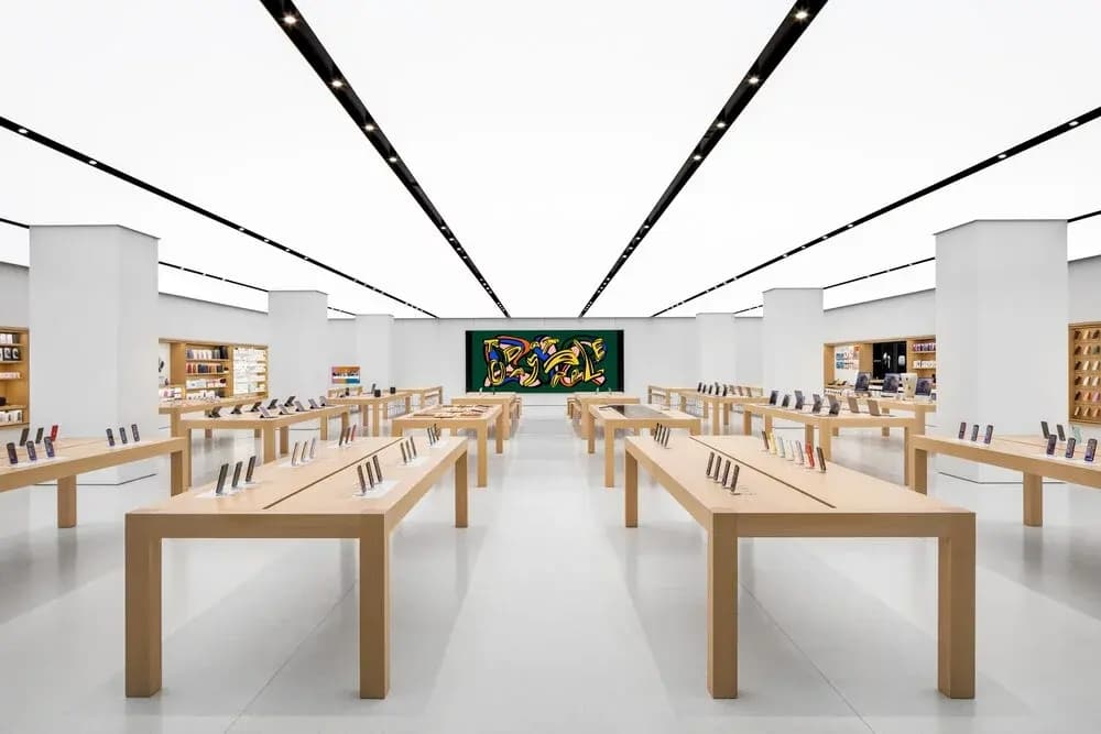
4. The Power of Color in Visual Marketing
The choice of colors for display props should harmonize with the brand image and convey the desired emotions and messages. Each color has its unique meaning and emotional associations, so selecting the right colors for your brand is crucial. For example, red can convey energy and passion, while blue is more calming and trustworthy. Ensuring that the colors of display props align with the brand's core values and personality enhances the consistency of the brand image.
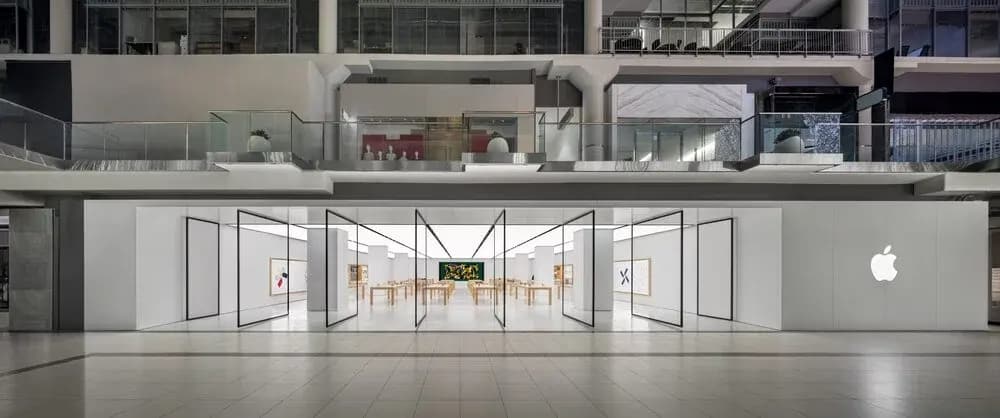
CF TORONTO EATON CENTRE LOCATION. PHOTO: APPLE
Reference Case:
Case Link:
Official Website: https://www.apple.com/retail/
Reference Case: https://retail-insider.com/retail-insider/2019/12/apple-opens-massive-store-at-cf-toronto-eaton-centrephotos/
Apple's store designs often feature neutral tones such as white, gray, and black. These colors convey the brand's modernity and minimalist style, aligning with the design philosophy of its products. Display props such as display cabinets, shelves, and tabletops are in neutral tones, emphasizing the appearance and functionality of the products.
CF TORONTO EATON CENTRE LOCATION. PHOTO: APPLE
Emphasizing Product Colors:
Although Apple uses neutral tones in their stores, they also focus on highlighting the colors of their products. For example, they use minimalist white or transparent display stands to make the product colors stand out. This contrast enhances the visibility of the products while maintaining a sense of overall store unity.
Minimalist Design:
Apple values minimalist design, and this is also reflected in their display props. They opt for clean and pure shapes and lines without excessive decoration. This design style, combined with neutral tones, highlights the modernity and sophistication of the brand image.
Literature References:
Pantone (www.pantone.com)
Color Psychology (www.colorpsychology.org)
Canva Color Palette Generator (www.canva.com/colors/color-palette-generator)
5. The Practicality and Functionality of Display Props
In addition to showcasing the brand image, display props should also possess practicality and functionality. Considering the needs for product display and customer interaction, selecting display props with appropriate functionality is essential, such as display shelves, cabinets, or demonstration counters. This can provide a better shopping experience, increase customer engagement, and enhance the brand's professional image.
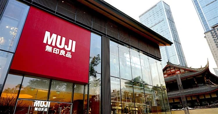
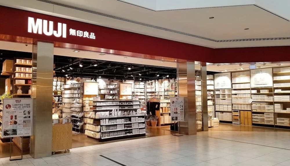
PHOTO: MUJI
Reference Case:
Case Link:
Official Website: https://www.muji.com/
Reference Case: https://retail-insider.com/retail-insider/2019/06/muji-to-open-largest-flagship-in-vancouver-area-in-surrey-mall/
Muji is a Japanese retail brand known for its minimalist, practical, and functional products. They cleverly utilize display shelves in their store design to provide practical display and showcasing solutions that align with their brand image.
Flexible and Adjustable Display Shelves:
Muji's stores often feature flexible and adjustable display shelves to accommodate different types and sizes of products. These shelves can be adjusted in height, width, and angle to maximize product visibility and meet various display needs. This practical design allows the store to effectively showcase different types of merchandise, providing a good shopping experience.
Multi-tiered and Multi-functional Display Shelves:
Muji frequently designs display shelves with multiple tiers and functions to maximize the utilization of store space and product display. They use shelves with multiple platforms or layers to showcase different product categories or sizes. This design approach offers more display options and enhances product visibility.
MUJI’S CF MARKVILLE LOCATION PHOTO: MUJI CANADA VIA FACEBOOK
Mobile Display Shelves:
To adapt to different store layouts and display requirements, Muji often incorporates mobile display shelves. These shelves are typically equipped with wheels or casters, allowing store staff to arrange and adjust them as needed. This design enables the store to flexibly handle display and layout, optimizing the showcasing effect and customer flow.
Integrated Display and Storage Functionality:
Muji's display shelves often incorporate integrated display and storage functionality. They design shelves with additional storage spaces, drawers, or adjustable shelves to provide extra storage while showcasing products. This design adds functionality to the store and caters to customers' display and storage needs.
Through the above case, Muji demonstrates how to utilize display shelves with practicality and functionality in store design. They employ flexible and adjustable, multi-tiered and multi-functional, mobile, and integrated display and storage shelves, providing customers with convenient, practical, and flexible shopping experiences while aligning with the brand's minimalist and practical image.
Literature References:
Retail Customer Experience (www.retailcustomerexperience.com)
Retail Dive (www.retaildive.com)
Retail TouchPoints (www.retailtouchpoints.com)
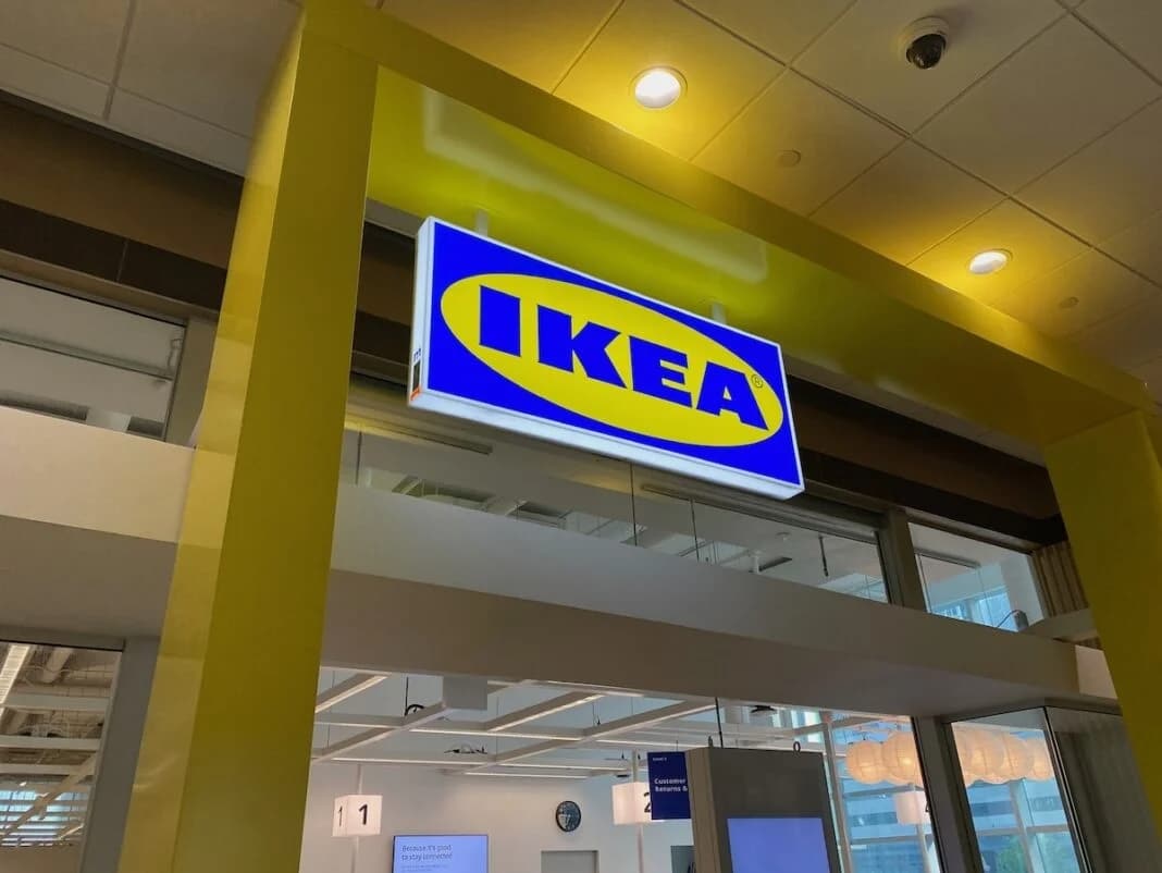
6. Selecting Display Props with Good Quality and Durability
Selecting display props with good quality and durability is a key factor in ensuring their long-term use and maintaining a good appearance. Choosing high-quality materials and craftsmanship ensures that display props can withstand daily use and environmental challenges. Sturdy and durable display props not only showcase the professionalism of the brand but also save costs on maintenance and replacement.
Reference Case:
Case Link:
Official Website: https://www.ikea.com/
Reference Case: https://retail-insider.com/?s=IKEA
IKEA Business at IKEA Aura - Downtown Toronto (Image: Dustin Fuhs)
IKEA, the Swedish home furnishings retail giant, is renowned for its high-quality, durable, and functional products. They place great emphasis on the quality and durability of display shelves in store design to ensure proper product display and long-lasting presentation.
Choice of High-Quality Materials:
IKEA uses high-quality materials such as sturdy metal, durable wood, or robust plastic to manufacture display shelves. They prioritize materials with characteristics such as compression resistance, wear resistance, and corrosion resistance to ensure the long-term use of display shelves.
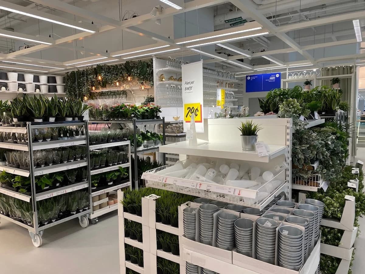
IKEA Business at IKEA Aura - Downtown Toronto (Image: Dustin Fuhs)
Robust and Stable Structural Design:
IKEA's display shelves typically feature robust and stable structural designs to withstand different types and weights of products. They employ reinforced connection methods, support structures, and stable bases to ensure that the display shelves do not wobble or tilt during use, maintaining stability and safety.
Durable Surface Treatment:
To increase the durability of display shelves, IKEA often applies special surface treatments such as scratch resistance, water resistance, or stain resistance. They utilize durable coatings or materials to resist scratches, water stains, or dirt that may occur during daily use, keeping the appearance of the display shelves clean and attractive.
Customizable and Replaceable Components:
Through the above case, IKEA demonstrates its emphasis on the quality and durability of display shelves. They select high-quality materials, employ robust and stable structural designs, perform durable surface treatments, and provide customizable and replaceable components. This design philosophy ensures the reliability and durability of display shelves, offering a lasting and dependable solution for product presentation while aligning with the brand's high-quality and functional image.
Literature References:
Material Bank (www.materialbank.com)
Architonic (www.architonic.com)
Retail Design World (www.retaildesignworld.com)
7. The importance of brand logos and signage in professional displays
Display props can serve as an ideal platform for showcasing brand logos and signage, helping customers easily identify and connect with your brand. Ensuring that brand logos are clearly visible on display props and consistent with the overall design contributes to enhancing brand recognizability and establishing a memorable brand image in the minds of customers.
Reference Case:
Case Link:
Nike Official Website: https://www.nike.com/
Reference Case 1: Design of Nike's concept store "Nike House of Innovation" in New York
Link: https://news.nike.com/news/nike-soho-house-of-innovation
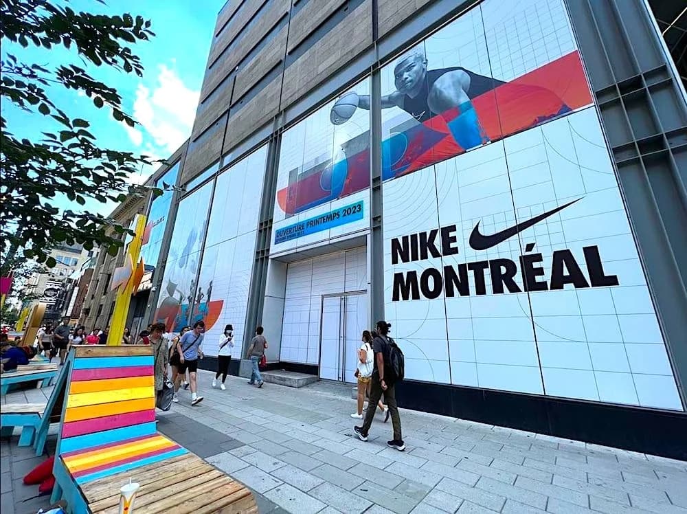
Photo: Maxime Frechette
Nike, a global leader in athletic footwear and apparel, is renowned for its iconic Swoosh logo and innovative products. They skillfully showcase and utilize brand logos and signage in their store designs to create brand recognition and identification.
Prominent and prominent brand logos:
Nike's stores typically place brand logos at the entrance or in prominent locations, allowing customers to quickly identify and connect with the brand. They often choose to display the Swoosh logo in a large and clear manner, using contrasting colors (such as black or white) to create a striking contrast with the background.
Creative use of signage:
Nike creatively employs brand signage in stores to create a unique and engaging environment. For example, they may use oversized Swoosh logos to decorate walls or combine signage with other elements such as display shelves, lightboxes, or murals. This creative use of signage enhances the visual impact of the brand and captures the attention of customers.
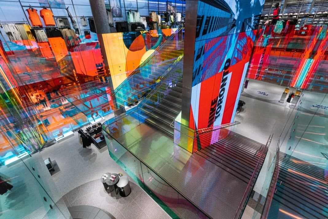
Photo: Maxime Frechette
Display of brand slogans and taglines:
Nike frequently displays brand slogans and taglines in their stores to further emphasize the brand image and core values. They can showcase eye-catching phrases on walls or display cases, such as "Just Do It," conveying messages of encouragement, inspiration, and vitality. This display method combines visually with the brand logo to reinforce the brand's messaging.
Integrated signage display across multiple channels:
Nike also integrates signage display across multiple channels in store designs to strengthen brand consistency. They align in-store signage and signage with the visual elements of online channels, mobile applications, and social media platforms. This integrated display approach helps establish cross-channel brand coherence and enhances the brand image in the minds of customers.
Through the above cases, Nike demonstrates how to showcase and utilize brand logos and signage in store design. They successfully shape brand recognizability and recognition through prominent logo displays, creative signage usage, the display of brand slogans and taglines, and integrated signage display across multiple channels.
Literature References:
Brandingmag (www.brandingmag.com)
Logo Design Love (www.logodesignlove.com)
Logo Lounge (www.logolounge.com)
8. Conclusion
Selecting display props that align with your brand image is an important step in creating a professional image and attracting your target audience. By researching your target audience, selecting materials, colors, and designs that are consistent with your brand image, and considering practicality and durability, you can create a professional display that matches your brand image. This will help you attract customer attention, convey brand values, and improve sales effectiveness.
Remember, brand consistency and the preferences of your target audience are key when selecting display props. Continuously monitor market trends and customer feedback, and make adjustments and optimizations as needed to ensure that your display props consistently align with your brand image and resonate strongly with your target audience.
We are a terminal factory that provides one-stop solutions for display props with price advantages.We are committed to providing a diverse range of cost-effective display fixture products for the retail industry. Whether you are in the footwear, apparel, or home goods business, we have suitable display racks, counters, and frames for you. These display props are manufactured using durable materials to ensure long-term usage and a pleasing appearance. Additionally, we offer customized services to tailor unique display fixtures according to your brand image and exhibition needs. By choosing our products, you will be able to attract customer attention, convey brand values, and enhance sales performance.If you have any inquiries about display props, feel free to contact us, and we will provide you with the most suitable display prop solutions for your needs!
Post time: May-11-2023